Some software interfaces are windows into collections of features. The Uber app, for example, literally opens with a screen full of buttons, each of which take you to a different screen with yet more buttons and inputs. Google Search is also built with features – inputs, buttons, and links that take you to different capabilities in the app – as the building block. In both of these cases, there are a few clear and obvious tasks the user wants to accomplish when they open the app. In the case of Uber, it’s to get somewhere or to order some food. On Google, it’s to find some website or information. Because there are well-defined paths for users to take, familiar interface elements like links and buttons to access different features makes a lot of sense.

For software like Figma, Apple Notes, and the humble file explorer, there aren’t such clearly defined tasks that users would want to accomplish when the open the app. People don’t open up a file browser to just create new files or just move files between folders; there are a million different things users may want to do with files, or with text inside their notes, or with shapes in their Figma boards. For these kinds of apps, software-as-a-bag-of-features doesn’t work. Instead, these apps present the user with materials and clear laws of physics governing how those materials behave. In Figma, these materials are shapes and text on the Figma board. In Apple Notes and similar text editors, users manipulate materials like text and pencil strokes. Within a file explorer, users work with the file object, which is only a loose metaphor for physical files. None of these software objects are faithful metaphors of real objects or even real physics, but they have internally consistent “laws of physics” of their own that govern how they behave. We learn to use such interface made of materials rather than features by internalizing these new laws of physics, and learning to work with new software materials.
I really like this model of software interfaces as users interacting with well-defined materials. Software constructed this way feels more open and creative, because they don’t prescribe a finite set of tasks you can accomplish with them. In feature-based interfaces, N features gives you N different capabilities. In material-based interfaces, N different materials gives you at least N × N different capabilities. Material-based software can also have gentler learning curves, because the user only needs to learn a small set of rules about how different metaphors in the software interact with each other rather than learning deep hierarchies of menus and terminologies. In the best case, users can continue to discover new capabilities and workflows long after the initial release of the software.
In Spatial Software, John Palmer writes about a similar mental model for spatial software:
This is our definition of spatial software. It is characterized by the ability to move bodies and objects freely, in a parallel to the real world. This is opposed to traditional software, which uses some other logic to organize its interface.
Figma and Second Life are examples of spatial software. They contain worlds where the relationships between objects on a canvas, or bodies in an environment, respectively, are the organizing logic of the interface. WhatsApp is not spatial software. The organizing logic of its interface is recency of messages, not spatial relationships.
In his model of spatial interfaces, objects and “bodies” (representing users) occupy some software “space”, moving around and interacting by well-defined rules. But I think we can expand this mental model to software that doesn’t use obvious “space” metaphors, too. In the version control software Git, programmers work primarily with software objects called “commits”. These commits are the basic building material of larger abstractions like branches and tags and releases in workflows using Git. Commits follow a very strictly defined set of rules: they can come before or after other commits. They can be “diffed” with other commits to generate a text diff of changes. They can interact with other commits in the same repository, but not with commits outside of it. Commits are the material from which the software interface of Git is built, even though there’s no obvious spatial metaphor in Git. Git isn’t a collection of features that let you operate on a project (though some use it as such), but a material (commits) and a set of tools to let you work with it flexibly. This enables Git to support a wide array of workflows without explicitly being designed for all them from the beginning.
		 o---B2
		/
---o---o---B1--o---o---o---B (origin/master)
	\
	 B0
	  \
	   D0---D1---D (topic)
(ASCII art courtesy of the git merge-base documentation)
Inventing new software materials
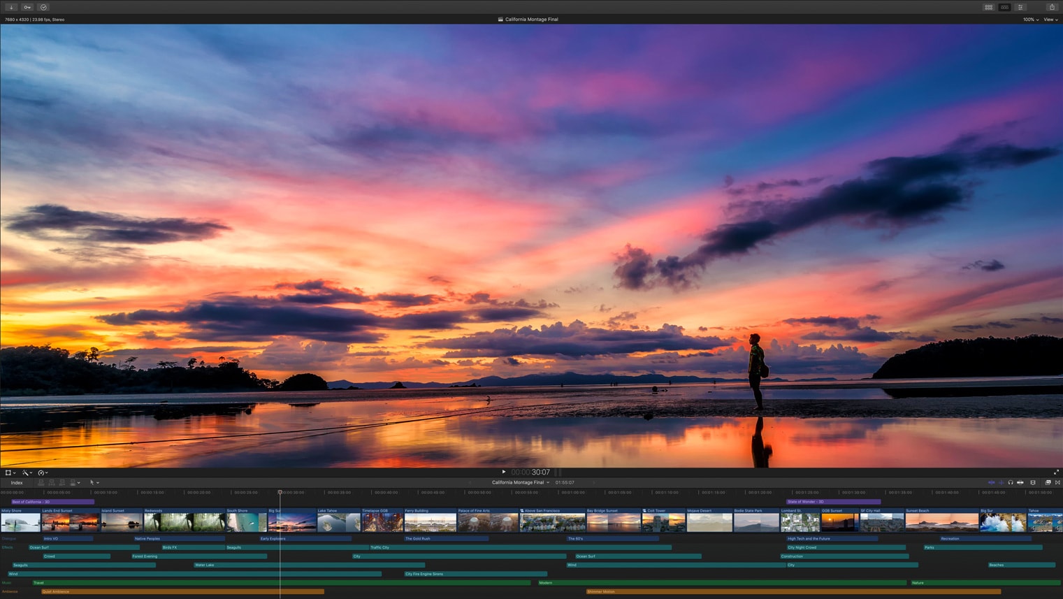
Powerful interface innovation happens when we discover new useful metaphors and reify them in new software materials. Take nonlinear video editing software, like Final Cut Pro and Premiere Pro, for example. Though they have their fair share of menu complexity, it’s pretty intuitive for anyone to understand the basic building blocks of video and audio clips sitting on a layered timeline. Here, the video and audio clips are composed of a software material that have their own laws of physics: they can grow and shrink to take up more or less time on the timeline. They can be moved around and layered in front of or behind other clips, but they can’t occupy the same space on the same “track” of the timeline. The timeline that runs left-to-right is a kind of “world” in which the materials of audio and video exist.

You might look at the example of video editors and say, “it’s pretty obvious that video editing should work this way.” So let’s take something for which we don’t currently have a good material-based interface, managing web browsing history, and imagine how we might improve it.
All popular web browsers currently expose browsing history as a simple list of URLs. Some of the more advanced, niche solutions let you work with history as trees, where each branch is a path you took exploring different trails of links. But these are weak abstractions. We can’t really do much with history entries in these interfaces except to re-open pages we had closed.
Tyler Angert has been working on a kind of “Git for web browsing sessions” as he described it to me, with a well-defined way to save and restore browsing sessions.
what if you could recreate an entire browsing session– tabs you had open, timestamps in a youtube video, positions and locations of your windows?
— tyler⏱ (@tylerangert) July 25, 2022
not only that but what if it was a new file format that could be shared around and used by all different kinds of apps?
coming soon pic.twitter.com/Va6ZZLK7ah
This idea made me wonder what the right software metaphor for “a point in my browsing history” would be. Here are some questions I would ask:
- Something discrete like files? Or something continuous like a video recording, from which you can “clip out” a section?
- Do we want hierarchy, so we can organize sessions into sub-sessions? Is browsing history a flat sequence of events, or sections with sub-parts?
- What should each “session” remember about its contents? Just the URL? Maybe occasional screenshots? Scroll history?
- Do browsing sessions have weight? A session with two windows and 30 tabs each certainly feels heavier than one where I just Googled a question and found an answer in the first tab I opened. How does this manifest in the metaphor?
- Some browsing sessions are definitely more salient and important to remember than others. How should we express this property?
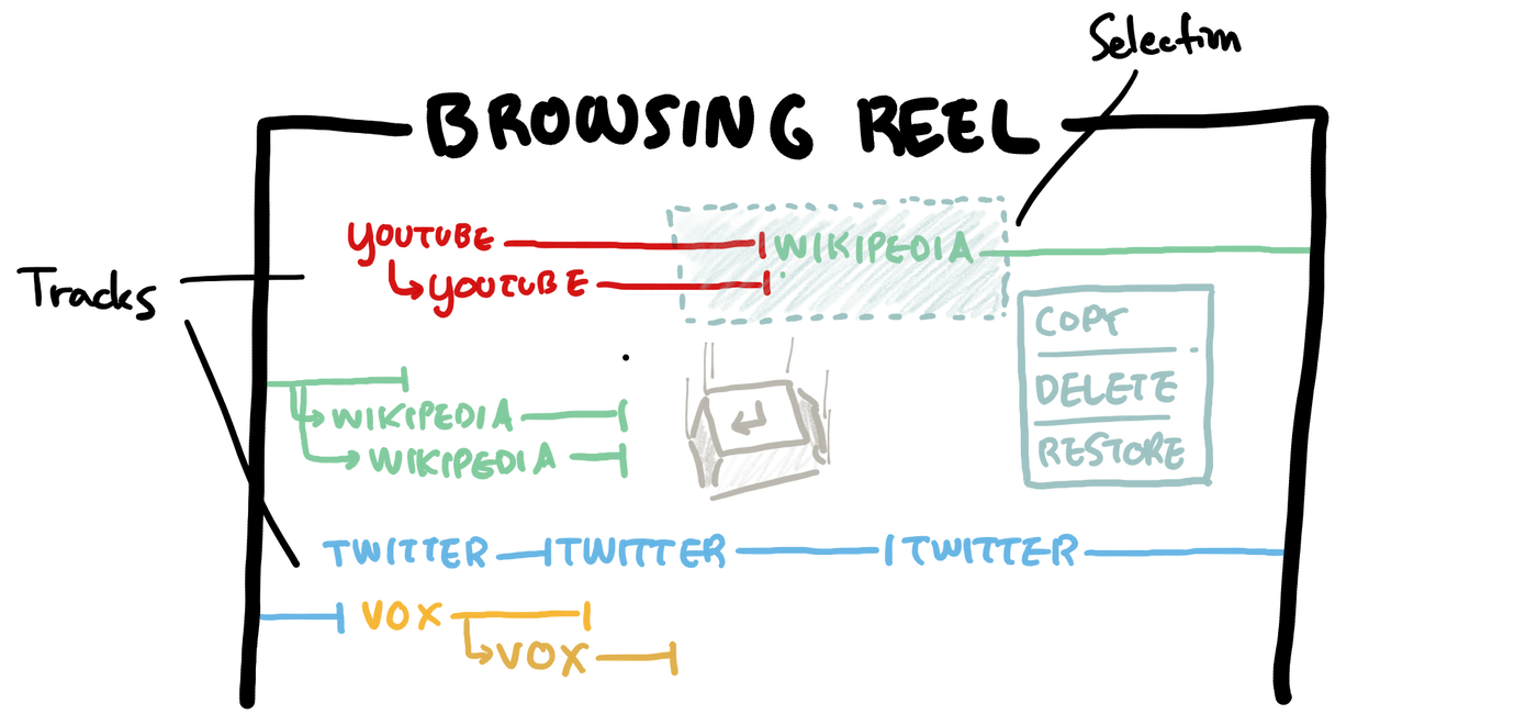
Thinking about these questions… here’s one interesting possibility. What if, as you were browsing the web, you were recording your history onto some “browsing reel” that felt like a video editor? Visiting each page would create a new “clip” on the recording’s timeline for that page. If you wanted to start a new “session”, you can simply hit Enter, and the “recording cursor” could move down to a new timeline, like making a new paragraph in a text editor.

After the fact, you could select sections of your browsing history and restore those open tabs, copy them and share them with collaborators, or even cut and paste them elsewhere on the timeline to rearrange them and produce an “edited” version of their history for later reference, with all the less important side-quests cut out.
Given that I just came up with this in a few minutes of sketching, nobody should probably build this. But there are some things I like about recording browsing history as a continuous timeline of clips. I also like that borrowing the clips-and-timelines metaphor of video editing implies an obvious interface for editing and exploring web browsing history.
An interface like this based on materials over features would naturally absorb some “features” of today’s browsers. We would be able to “re-open closed tabs”, for example, by just selecting the most recent section of the recording timeline and opening all the pages again.
Software materials for thought
Once again, I’m taking it all back to creative thinking tools.
Most “tools for thought” these days work with two fundamental “software materials” – text spans and files. Note-taking and writing apps are mostly spatial interfaces where the users uses a cursor to manipulate the material of text. At a higher level, many of these apps store information from the user in files for sharing, backup, and organization.
As we begin to ask more of our thinking tools than just hyperlinked text editing, we may benefit from inventing new software materials to represent ideas, at a slightly higher level than text, but slightly lower level than files, with something much, much smarter leveraging modern advances in AI and NLP. I think our current abstractions for text and files are good for operations at that level – editing text at a character level and moving information around in files and folders – but they don’t really help us work with ideas as effectively as they could, because the information expressed in the text is opaque to software tools.
In a previous post, I speculated on some properties that a “software representation for thought” should have. They were:
- We should be able to directly manipulate them, like files, rather than only indirectly work with them, like layer activations in a neural network.
- Software representations for similar ideas should be obviously similar in some way – they should click together, or look similar, or feel similar to the touch.
- Ideas should remember where they came from – what blog I copied it from, which author I quoted it from, and so on.
Ambitious note-takers use workflows today that fit some of these requirements, through sheer force of will. For example, we could just adhere to a self-imposed policy of tagging every quote with a URL of its original document. But I think a new software material for thought that naturally embodied these properties would give rise to more intuitive workflows that let its users work more effectively without complicating their responsibilities.
When designing new tools for thought, let’s think not just in terms of features, but materials – what software laws of physics do we want embodiments of our thoughts to obey?
I share new posts on my newsletter. If you liked this one, you should consider joining the list.
Have a comment or response? You can email me.