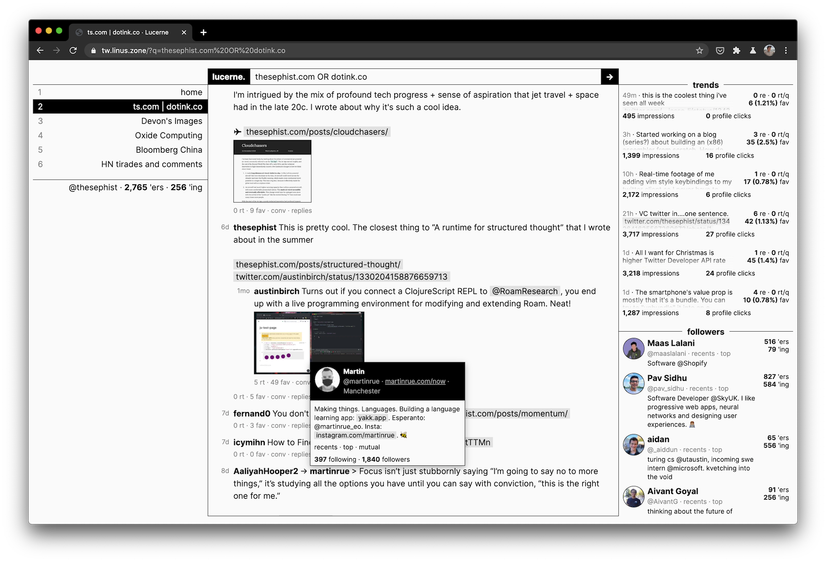
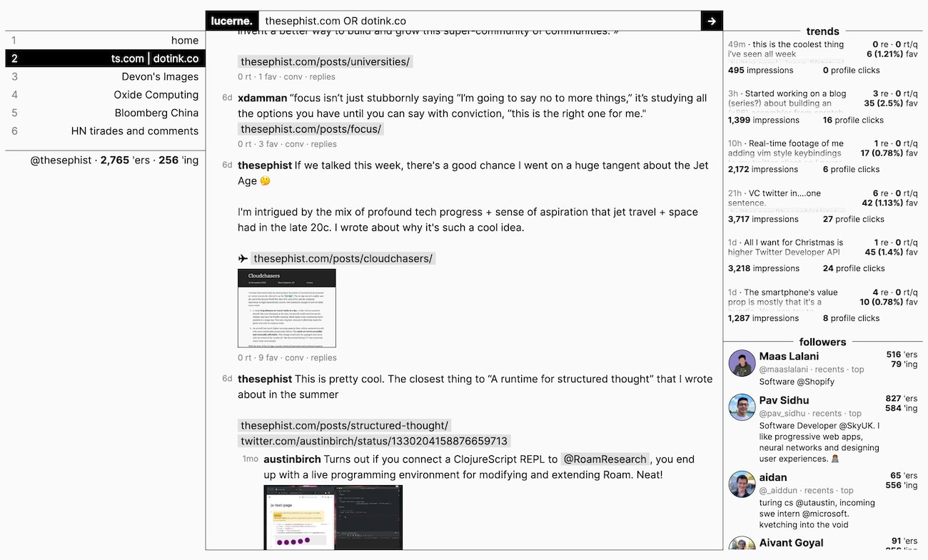
Over the last week, I’ve been working on Lucerne, a Twitter “reader” app built to fit my personal needs from Twitter. It’s been an interesting exercise in building a tool around workflows, so I wanted to tell you the story of how the design came to be, and what I’ve noticed using Lucerne for my daily escapades into the Twittersphere.

Like many of my personal tools, Lucerne is built with my Ink programming language on the backend and my Torus UI library on the frontend. It’s made just for me at the moment, but given the interest I’ve gotten about Lucerne online, I might make a version open for anyone to use.
Designing myself a better Twitter
For me, Twitter serves two purposes. First, it’s a learning tool. There are lots of smart folks talking to each other and sharing what they’re thinking about on Twitter from software to economics to writing, and I can find on Twitter opinions or perspectives I can’t find on blogs or books. Second, it’s a place for me to share whatever I’m working on on my blog or on my side projects with my audience. Lucerne is designed around these two primary workflows: learning and sharing.
Twitter’s main user interface, the algorithmic timeline, is bad for using Twitter as a learning tool. It feels like sticking a straw into a firehouse and hoping you’ll suck out enough interesting insights to be worth the effort. I wanted a better way for me to discover and keep track of interesting conversations happening on Twitter about any topic. Twitter does provide decent tools for me to share my work online – things like scheduled tweets, analytics, notifications, and search – but they’re not in one place, so I wanted to consolidate these tools.

With these two goals in mind, I also wanted Lucerne to be a tool that could grow with me as I used it, so I could mold my experience of Twitter around what I found to be most useful to me over time. More than other tools, Twitter feels organic and constantly changing. I didn’t want to have to bake in all the tools and dials I might ever want to use from the get-go. Instead, I wanted to be able to stumble into interesting use cases as I used Lucerne over time.

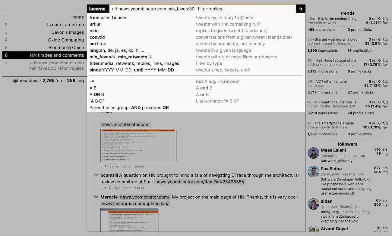
To make it possible to grow Lucerne as a tool gradually around my use cases like this, Lucerne is designed primarily around one important idea: filtered searches saved as “channels”. Feeding from the firehose of conversations on Twitter, a “channel” is a small filtered stream of tweets defined by a particular search query. Here are some examples of useful filters.
- “tweets between A and B about #topic” –
(from:A OR from:B) #topic - “tweets about abc.com with more than 100 likes” –
url:abc.com min_faves:100 - “tweets by A that include images, but exclude retweets” –
from:A filter:images -filter:retweets
With Lucerne, I can search for interesting conversations happening on Twitter by experimenting with these filters. When any filter seems particular useful, I can save it to check again later, by adding it to the left sidebar with a name. As I use the app, I end up curating an ever-changing personalized collection of these channels in my sidebar that provide multiple different views onto the firehose of Twitter.
“But Linus,” I hear you saying, “you can search and save them as timelines on Twitter’s app and Tweetdeck.” Yes, you’re right, and most of the search filters Lucerne uses are also available on Twitter. But the important thing about Lucerne isn’t just that you can search, but that playing with filters and saving the good ones is the primary user interface. On Twitter, you might search once or twice to find something useful, but you’re mostly interacting with a single timeline passively. With Lucerne, most of my use is exploring and adding to a curated list of filters, and exploration and consumption are one and the same activity. As I’ll explain later from my personal experience, this makes a big difference in how much I can get out of Twitter.
I think the most important design lessons in Lucerne is what I didn’t do: I could have made a list of features that I might have wanted in the beginning, and baked it all into the app. Features like “follow specific threads”, “see top tweets from a particular user”, “follow hashtags”, or “hide retweets from the timeline.” But instead of adding a million settings and toggles, I found what I would consider to be the “atoms”, the common building blocks, of all of these use cases, and baked it into the core of the app instead. All these use cases above can be performed just as easily as filtered searches, and because these filters can be saved and referenced later, Lucerne can grow around my exact use cases as I continue using it. I don’t have to design for all my use cases from the start. This is what I mean when I say we need to design tools to grow with us.
In addition to this main idea of channels, Lucerne has a few other design considerations to improve how Twitter works for me. All the engagement stats I care about are present in a single screen, so I don’t have to annoyingly load five different pages every time, but they’re out of the way of the main “timeline” view, because I don’t want them in my face all the time. There’s a small pane on the right showing me my most recent new followers, which is sometimes useful when I see someone particularly interesting and want to reach back out to them. This also saves me a few clicks every time. Lastly, I intentionally didn’t implement infinite scrolling, in lieu of a simple “load more” button. This makes endlessly scrolling a conscious enough action for me that I end up wasting less time scrolling through my timeline. It goes without saying, all of these experiences are also much better because I don’t serve myself ads in between my tweets. My timeline feels cleaner.
How I’m using Lucerne
I reached an “MVP” stage with Lucerne a few days ago, and since then, I’ve used Lucerne more and Twitter’s website less for browsing through Twitter. Lucerne isn’t meant to be a Twitter replacement. Twitter’s web app is still great for writing and following threads, for example, and I don’t want to have to re-create something that’s already fine for my use. But for my two main workflows of learning and tracking my progress on Twitter, Lucerne works better for me.
The biggest change I’ve noticed from using the client is that it turns Twitter from a consumption experience into an exploratory experience. Instead of drinking from a firehose through a straw, the firehose feeds into an evolving castle of infinite fountains, and my job is to look around the castle for the fountains of information that seem more interesting or insightful. For the first time in a long time, I feel like I’m pulling from the firehose of Twitter instead of constantly poking straws into the stream to see what I luck out with.
The real fun of using Lucerne to explore Twitter isn’t just reading tweets in a timeline, but poking around in the infinite library that Twitter sometimes feels like, collecting the interesting streams of information into my pocket.
Here are a few use cases I stumbled into while using Lucerne that I otherwise couldn’t have.
Following interesting threads. I often stumble into interesting threads of tweets that I want to track somehow. While using Lucerne, I ran into one tweet about @geoffreylitt building a Twitter browser extension called Twemex, and another thread by @TZhongg asking for book recommendations. Normally, I would probably just bookmark it and never check it again, but with Lucerne, I just saved filters for “replies to this tweet” as channels in my sidebar, and I’ve checked them regularly since to find interesting project updates and book recommendations.
Following an account’s tweets on a topic. @Noahpinion is one of those accounts that have a lot of interesting ideas to share covering a huge range of topics. Sometimes about foreign policy, sometimes about fiscal policy and economics, sometimes about China. I wanted to be able to follow “just tweets about this account on Japan”, for example, and I could do this trivially by setting up a channel from:Noahpinion Japan.

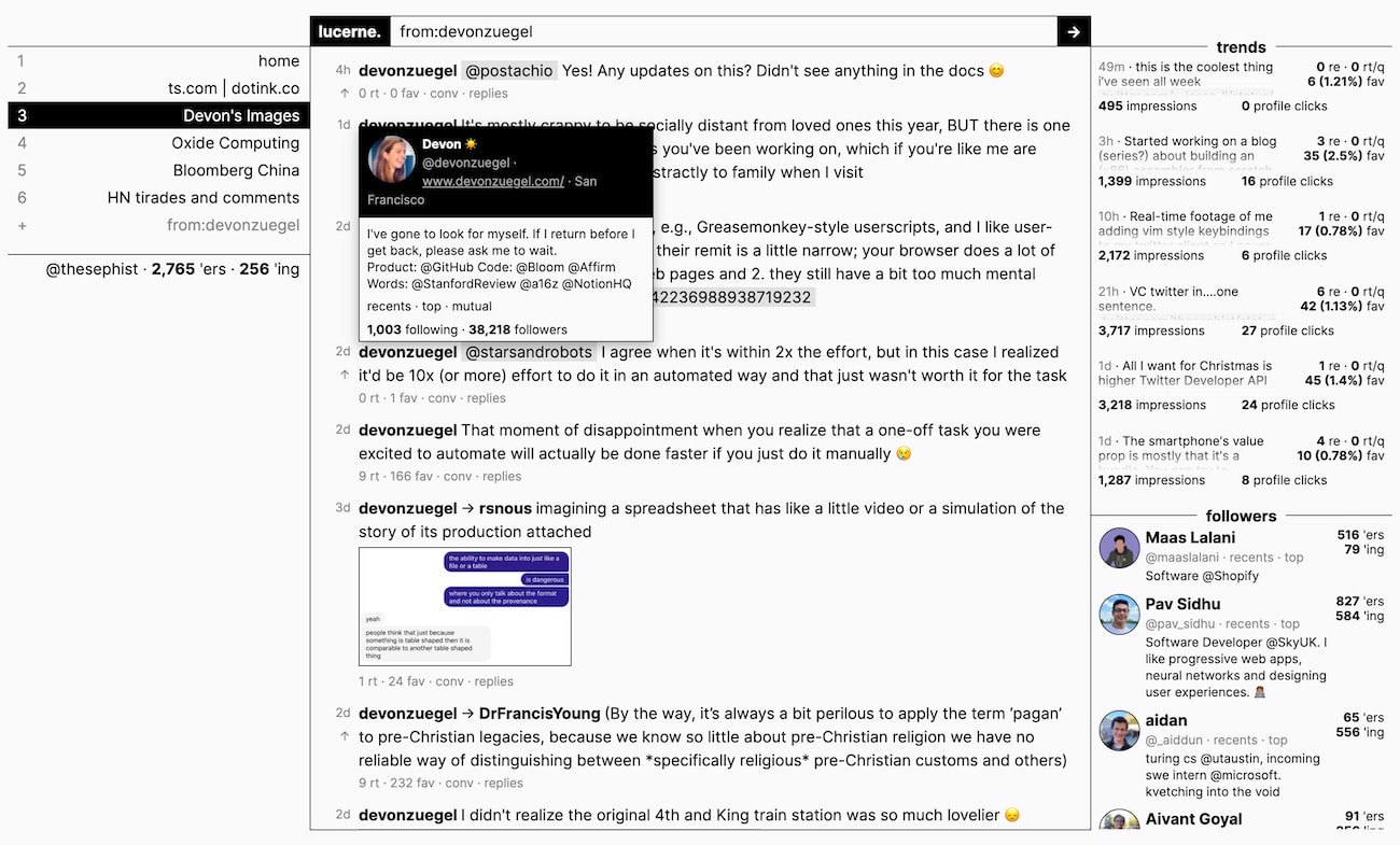
Following an aesthetic. I noticed recently that a lot of @devonzuegel’s tweets about urban design either contain interesting quotes from books or inspiring historical photographs. I follow her, but thought it would be nice to have a separate channel to just keep track of these. So I made a filter for from:devonzuegel filter:images, for “tweets containing images from @devonzuegel” which I’ve been enjoying checking once every one or two days. Through this channel, I also discovered a couple of other accounts that share photographs of urban design that I otherwise would have missed.
“Following” high-noise accounts without following. There are a few accounts, like @naval, @david_perell, or @paulg that occasionally tweet really interesting ideas, but whom I don’t follow because there’s a lot of noise. With Lucerne, I could create channels like from:david_perell -filter:replies min_faves:100 to “follow” the most popular tweets from these accounts without actually following them into my home timeline. I’ve found this so useful that I added a “top” button to profile cards that lets me one-click search a filter for “popular tweets from this person”, which is much more helpful than what Twitter’s web app gets you on a profile page, which are just the latest tweets they happened to have sent.
Over time, I think my curated list of channels is going to become an interesting index into my own interests, perspective, and information consumption habits, which I find a really cool idea. I’m excited about how Lucerne can help me use Twitter to learn and share better going forward, and I"m also curious about how I could apply this idea of “tools that grow as you use it” to other parts of my life, like the web browser or my email experience.
And because I know you’re asking: while I don’t think I’m going to make this current version of Lucerne open for public use, it’s open source on GitHub if you want to check out how it works. Try to use it at your own risk, though – I make no promises about how my programming language might work on your system! Given the positive feedback I’ve received about the channels concept, I might also make a public version of Lucerne that you can use in the future. As always, you can join me in following how all this unfolds on my Twitter.
← Beyond customization: build tools that grow with us
My goals for 2021, interesting lives, and other considerations →
I share new posts on my newsletter. If you liked this one, you should consider joining the list.
Have a comment or response? You can email me.