Humans are bad at coming up with search queries. Humans are good at incrementally narrowing down options with a series of filters, and pointing where they want to go next. This seems obvious, but we keep building interfaces for finding information that look more like Google Search and less like a map.
All information tools have to give users some way to find the information they’re looking for. For Google Search, it’s mainly the search bar. For a notes app, it may also be a search bar, but may also include things like links between notes, nested hierarchy of folders, or something like a “recently edited” page. For social media sites or other online services, the best way to find information may actually be some algorithmic recommendation system or a social feed.
All of these things, from text search boxes to links to algorithmic feeds, occupy places on a single spectrum, the spectrum of “interfaces people use to find information”. On one side are interfaces that teleport the user straight to the result, like URLs or search. These interfaces can be precise, but if the results aren’t what you want, you have to try again from the beginning – there isn’t an “incremental” way to use text search or URLs if you feel like you’re close but slightly off. Sure, you can tweak the search query a bit and re-search, but it may land you somewhere completely different.

On the other side of the spectrum are interfaces for approaching what exactly you’re looking for incrementally – links and recommendation systems. With these, you may not start exactly where you want to be, but with every click you can tell whether you’re getting closer or farther. Over time, not only are you likely to stumble into what you were looking for, you also end up with a mental map of a bunch of things related to what you were looking for that may be just as interesting to you.
Different they may seem, search, tags, folders, hyperlinks, and algorithmic recommendations are all really interface ideas trying to address the same fundamental problem: looking for the needle in an information haystack.
So which one is best?
In some cases, the right interface idea is obvious. For example, when you’re Google trying to make the entire web accessible, you can’t expect people to learn some monstrous cataloging system of folders to find what they need. There probably exists no tagging system comprehensive enough to cover the entire web, either. So the natural choice is the blunt instrument: text search. On the other hand if you’re building an app to help people find restaurants in the area, a literal, geographical map with some sensible filters and tags makes more sense than a hyperlinked web of restaurant reviews, because there is already some pre-existing organization scheme that most people are used to – geography and food preferences.
But when designing an interface for finding a note in a small pile of personal notes, or building an app to organize a small team’s working documents, most of the “finding stuff” interface ideas are in play. It’s in these situations where I want to make the argument: prefer interfaces that let the user incrementally move towards the right answer over direct search.
Humans are much better at choosing between a few options than conjuring an answer from scratch. We’re also much better at incrementally approaching the right answer by pointing towards the right direction than nailing the right search term from the beginning. When it’s possible to take a “type in a query” kind of interface and make it more incrementally explorable, I think it’s almost always going to produce a more intuitive and powerful interface.
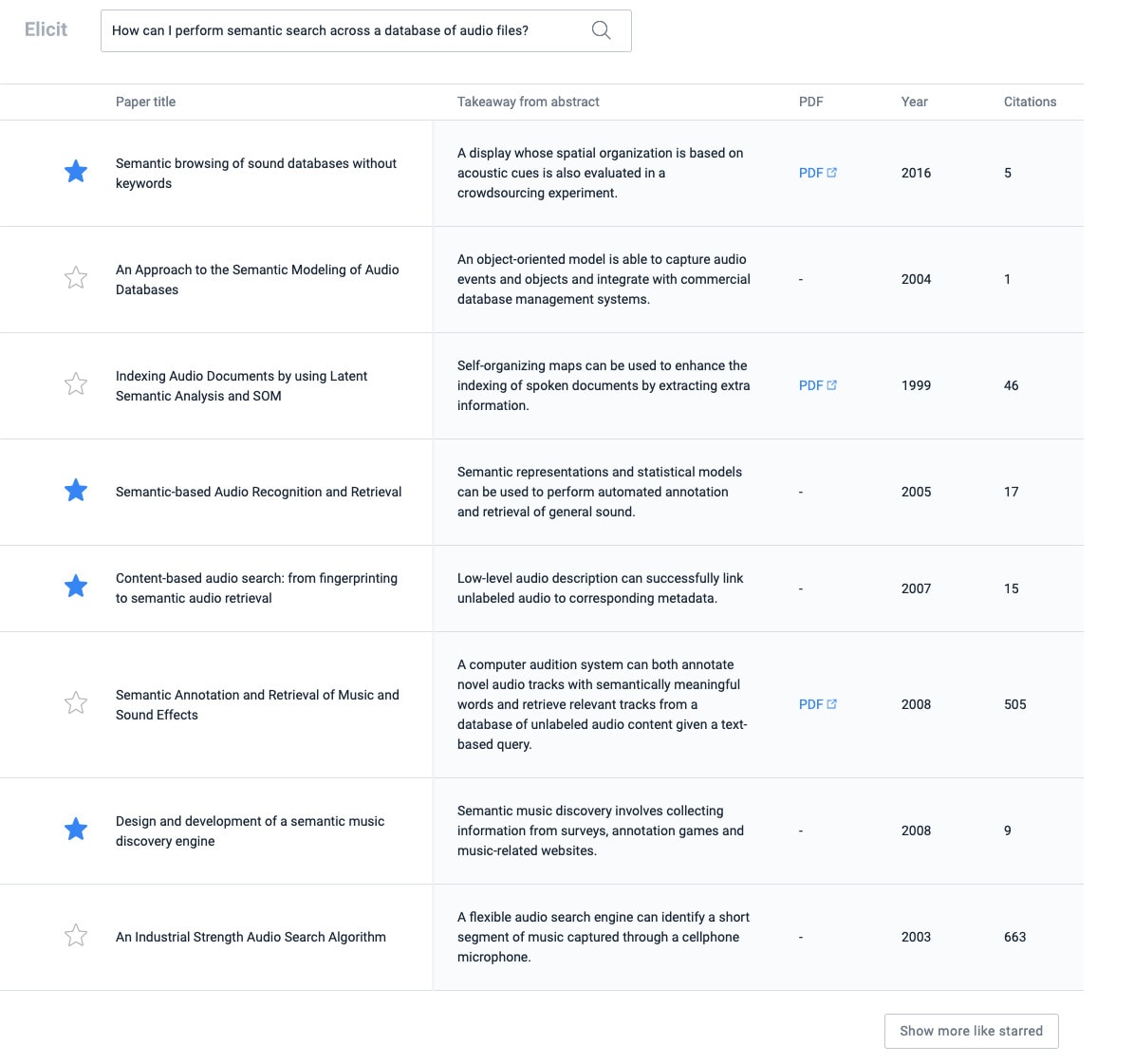
Of course, search and incremental filtering are not mutually exclusive features. The language model-powered literature review tool Elicit shows an interesting way to make search incrementally explorable. In Elicit, after I search for a question like “How can I perform semantic search across a database of audio files?” I can select a few papers I like, and ask Elicit to show more results similar to the ones I just selected.
Incremental filtering interfaces also shine when the search space isn’t something that can easily be verbalized into keywords, like photo or audio search, or medical images. Cai et. al. prototyped an interface for medical professionals to study images of tissue biopsies for signs of cancer. In this interface, users can select images or sections of images and ask the system for “more images like this” tagged with diagnoses. The system uses image embeddings generated by a neural computer vision model to help the user explore the abstract space of tissue images incrementally. In this kind of a use case, it would be daunting or impossible to build an interface where the user could type in text queries to find the right comparison images. For this “finding information” problem, an incremental search interface is clearly the right one, simultaneously more intuitive and more powerful.
I’ve been pondering this gap between one-shot and incremental information-finding interfaces in the context of knowledge tools recently. Text search boxes are easy to design and easy to add to apps. But I think their ease on developers may be leading us to ignore potential interface ideas that could let us discover better ideas, faster.
I share new posts on my newsletter. If you liked this one, you should consider joining the list.
Have a comment or response? You can email me.