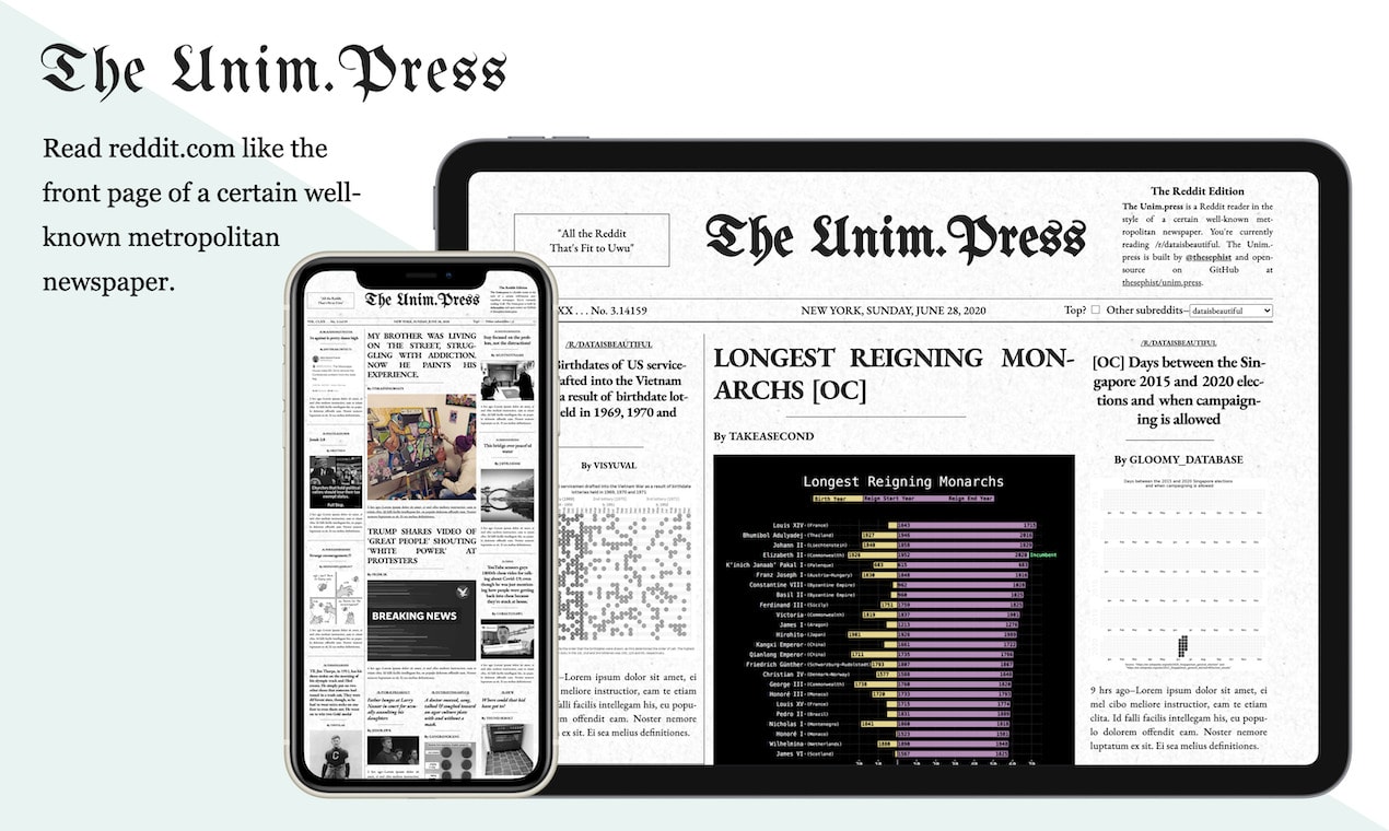
Last Friday, I made and launched Unim.press (I pronounce it “un-impress”, but in retrospect, not a great name), a Reddit browser that looks like the front page of a certain well-known metropolitan newspaper. It’s a visual aesthetic befitting of Reddit’s nickname as the Front Page of the Internet.
Over the weekend, Unim.press collected over 50,000 views from a pretty global audience. It reached the top of Hacker News and Product Hunt, and climbed to #3 on /r/programming. The project was also covered by GenBeta in a story. It was an interesting process, so I thought I’d share the story of making Unim.press as a case study of how I approach my small side projects.

Build
I built Unim.press over six hours last Friday afternoon, from my first commit at 2PM when I started building it, to a little past 7:30 when I finished. Relying on Torus, I designed it as a static site that rendered entirely client-side. This has some downsides, like its apparent issues on some configurations of Firefox that block the Reddit API, but this backend-less simplicity – the project is effectively a single main.js file – allowed me to build and launch it in six hours. I consider that a net win.
Idea
I don’t remember how I first got the idea, but the first version of what eventually turned into Unim.press wasn’t what it is now. I recall thinking that it would be nice to have a way to read stories from Hacker News in a newspaper-like visual layout. And while I was making a new feed aggregator, I thought, I might as well add Reddit into the picture. I had built a Hacker News reader before, so I knew that the HN API was accessible from the client-side without a need for a backend proxy, and I searched Reddit’s API documentation to find that, indeed, it also allowed cross-origin queries for listing stories (other endpoints require various levels of authentication). This was a good start. I could build a static site, query both APIs from the browser, and merge the feeds together into a newspaper format.
Name
Next up was choosing a name. My first inclination was towards names of classic American authors, to evoke the printed-paper feel. Names like (Mark) Twain, (Kurt) Vonnegut, (George) Orwell. I liked Orwell, particularly for its dystopian feel, but ultimately decided I wanted this site to be more meme-y than serious, so I abandoned this trail of thought altogether. Instead, I searched for a domain ending in “.press” – cy.press, letter.press, inter.press (which I liked because of its “internet” and “press” combination), auto.press, counter.press – all taken. After searching through some dictionaries, I settled on unim.press, as in “I’m unimpressed with these news stories,” but I don’t think many people got the meaning. I don’t regret the name, but doing it again, I’d probably pick a more obvious one.
Code
Next, I searched for some example images of newspaper front pages, and spent some time studying the headers of New York Times and the Wall Street Journal. Ultimately I decided that NYT’s front page was the most iconic and recognizable, so I based all subsequent design decisions on the front page layout of the New York Times. After some quick web searches, I also found that the Times had recently switched to using Georgia as its serif typeface, so I picked relatively similar font faces from Google Fonts, and another Fraktur one for the header.

After a brief setup, I started writing code, beginning with fetching and converting stories from Hacker News and Reddit into a single unified format (recall that in the beginning, Unim.press was a Reddit and Hacker News aggregator). The trace of this beginning is still in the codebase. The stories are still processed in a source-agnostic unified format, and you can still browse Hacker News on the site if you go to unim.press/#hn.
I kept the Hacker News / Reddit combination for the project until I started working on the interface. After some experiments, I realized that Hacker News and Reddit, despite both being voting-based feeds, have quite different kinds of stories. Reddit was more media-rich and had shorter, punchier headlines; Hacker News had longer-form articles, no media linked to the posts, and usually no text body of a post either. Because of this, I had to pick one of the two sources to primarily support in the design, and I chose Reddit. Reddit stories were more interesting with richer media, and I could fetch the entire “top 25” feed of a subreddit in one API call, rather than the over two dozen calls I needed for Hacker News.
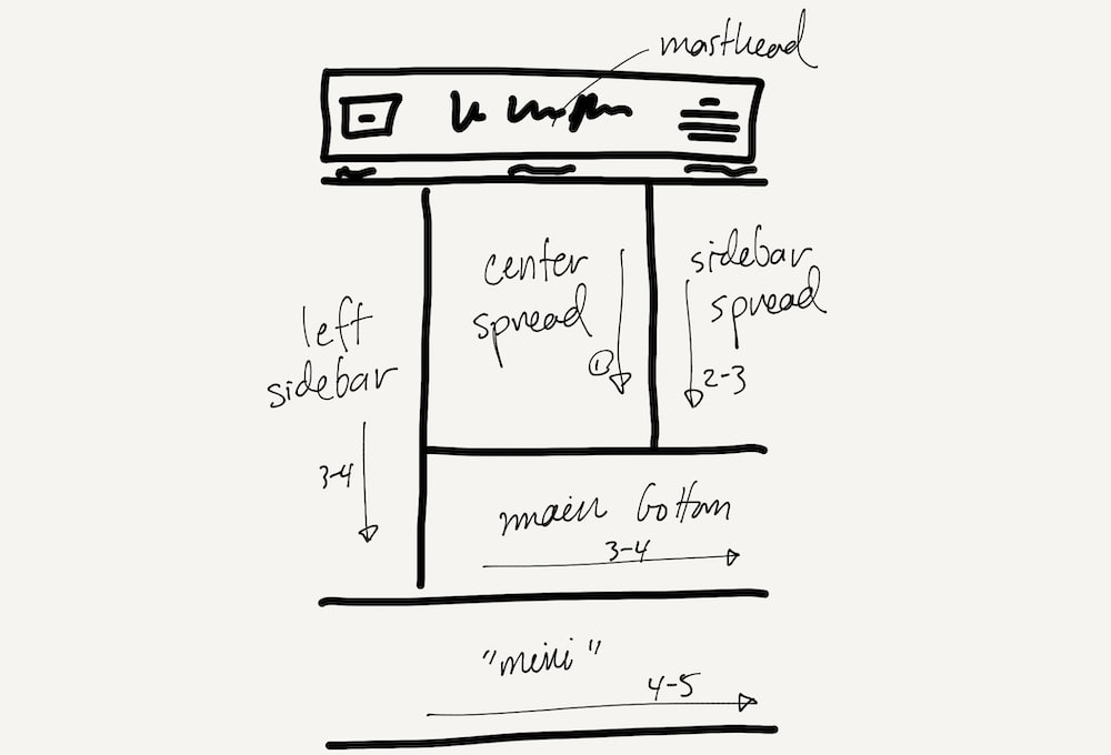
Once I had the data coming in, I started working on the page layout. This turns out to be a tricky problem. In newspaper publishing, the editors have a chance to human-curate where stories go on the front page, taking into account photographs, the importance and length of headlines, and the relative sizes of each front-page story. As a result, editors usually fill the front page of a print newspaper exactly, with judicious gaps and margins. The layout differs from day to day, as the stories change. This was too complex a problem for me to solve in the general case, so I opted to settle on a single, fixed, newspaper-esque layout, and calibrate the exact dimensions and story arrangements on the page later. Looking at some scans of past front pages of the Times, I chose to implement the following fixed layout.

When I build a layout, I almost always start from a smaller “mobile” view. This forces me to prioritize which pieces of information and interactions on the page are truly important, and makes it easy to design larger-screen views by adding back content. I couldn’t do that for this project, though, because realistically, a “mobile view” would have meant a single column of stories, and a single column of stories no longer feels like newspaper. I considered making the site non-responsive, but that also felt like a bad experience, forcing the user to work around the page’s fixed size. In the end, I compromised. The page keeps a fixed newspaper layout, and the overall size of the “paper” changes to fit the viewport width exactly, no matter the screen size. You’re always looking at the “entire front page”. This makes the page less useful, because reading small text is difficult to impossible on a phone screen, but since this was more of a design experiment than a useful reader app, I was okay with this solution.
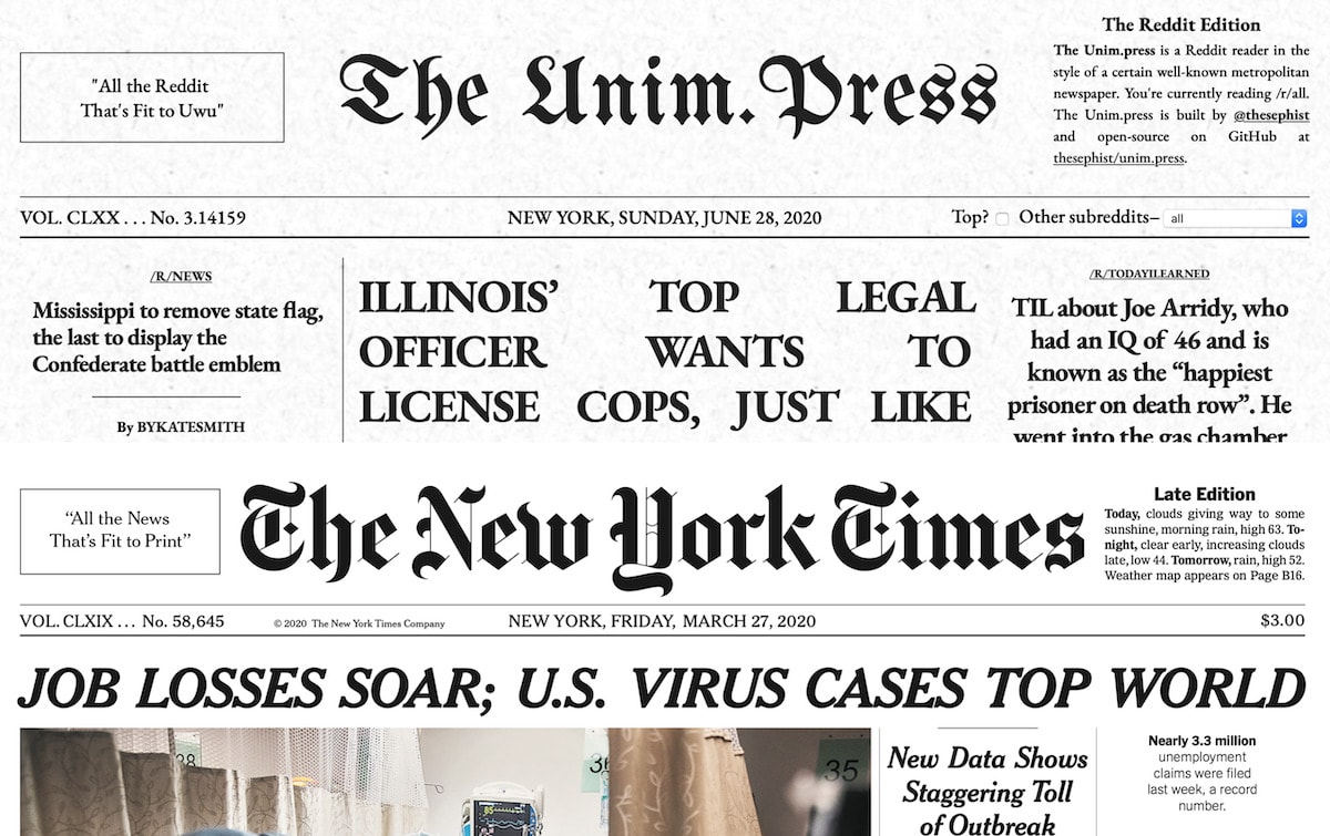
By 6PM, I had converted the Times’s front-page style of headlines, body text, and layout pretty closely to Unim.press. I spent the next hour making the header match the real thing, as in the image above, with one change: rather than the price of the issue, which is useless in this case, I used the right side of the header to provide a selector to pick a particular subreddit to load. I added a papery background, and made some layout adjustments until it felt right. I added some Easter Eggs like “All the Reddit Fit to Uwu” on the top left corner, and a description of the project that replaces the NYT’s “Late Edition” box on the top right of the page.
The “MVP” was complete. It was 7:02PM.
Launch
The project worked at this point, but I had to tweak and add a few things before I deemed it ready to share with the world:
- I added a “loading stories…” indicator while the page calls the Reddit API, with a nice animation for polish.
- I studied the Reddit API a little further and found that I was using an outdated way to find a thumbnail image for each post. I switched how I retrieved story images, so thumbnail images showed up with a higher resolution.
- I added some documentation in the code, and updated the project README to include a screenshot and a brief description for a more presentable GitHub repository.
- I added Open Graph tags and Twitter Card tags for those platforms to be able to present a nice card UI for any links to the page. I’ve found that this helps with engagement on social platforms immensely. I have a short template I copy-paste between projects for my use.
Since this is a stateless, static site, I chose to deploy Unim.press with Vercel. I don’t use their serverless products anymore for personal projects because of concerns around long term platform lock-in, but their GitHub integration makes static deploys and CI/CD from GitHub fast and painless. This took a few minutes.
Once the site was up and running, I wrote up quick posts on Twitter and Facebook, my normal outlets for new side projects. I normally only share blog posts to Hacker News, but I decided to share this to the site as well on a whim. I had shared some work-in-progress pictures of a design prototype with a maker Slack group earlier, and got some positive reactions, so I thought it had a chance of catching on.
Then I went to get dinner, because I hadn’t eaten since lunch and it was almost 8PM.
Aftermath
I haven’t had a lot of luck on Hacker News – the last time I was in the top 10 was last summer, with my How I Side Project essay, but I kept an eye on the site regardless. Given the history, I was surprised to find it climbing the ranks in the mid-teens. I shared my surprise with some close friends, who also checked out the site. I also cross-posted the project to /r/webdev and /r/IMadeThis, in the hopes of capturing some interest on Reddit.
What happens next isn’t really a product of any measured promotional decisions. I suppose the concept itself really resonated with the Hacker News audience. At this point, it was getting to be late in the date in the US East Coast, but I watched the post climb on Hacker News and kept an eye on the comments. At this point, I had no analytics, and the static site didn’t leave any access logs for me to visit to check on traffic analytics, so I just lurked in the Hacker News comments and answered any questions that came up.
There, I was informed of some bugs there around parsing Reddit’s API response, which I subsequently fixed. I also merged a pull request at this time to fix an edge case in the Reddit API I hadn’t caught in my testing. The simplicity of a static site made deployment and scaling around this trivial.
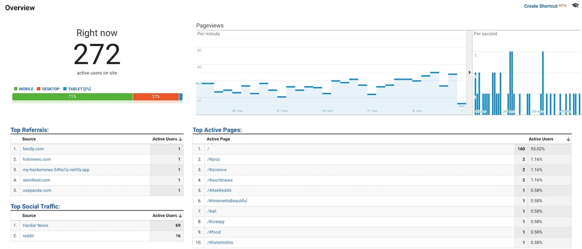
As my story reached top 5 on the site, I realized I should probably be collecting some form of analytics, if only to satisfy my curiosity on which subreddits people were visiting and where people were discovering Unim.press online. So at 1:30AM, a little bit after the story ranked #2 on the site, I updated the site with Google Analytics. (Given more time, I’d probably have looked into a lighter-weight solution like SimpleAnalytics or Fathom, but time was of the essence and I had set up Google Analytics prior.)

For the rest of the night, I stayed up listening to comments, fixing bugs that crept up, and looking out for any new sources of referral online. I discovered that people had shared Unim.press on /r/programming on Reddit, where it stayed #3 for the rest of the day, and /r/Italy, where it stayed #2 for much of the day. When the project was at the top of Hacker News, it received 50-60 visits a minute, which trailed off into somewhere in the high 20’s as the day broke.
I slept briefly from 7:30AM until noon (from what I can infer by my commit history).
After the nap, I updated the site with the option to see all-time top posts of any subreddit, which I do from time to time when discovering new subreddits. I use it often, but this turned out not to be a popular feature. People either didn’t share my workflow, or the checkbox on the page wasn’t intuitive enough.
Unim.press stayed on the front page of the site for the rest of the day, and into the next morning. During these first 48 hours of the project, Unim.press received around 50,000 pageviews from 40,000 visitors, mostly from Hacker News, /r/Italy, and Twitter. I had other work to do, but periodically returned to Hacker News, Reddit, and Twitter to participate in conversations and see any new feedback. On Twitter, in particular, I was able to find other people talking about the project by searching for the “unim.press” domain, which was unique enough to be useful as a search query.
The next day, a similar project surfaced on Hacker News with a bigger focus on parsing article content and on Hacker News’s feed, specifically. Given the popularity of the concept, I’ve also now launched the project on Product Hunt, with their slightly different audience, where it also briefly reached the #1 spot. I even whipped up quite a nice graphic for the occasion with Keynote, which you see at the top of this post.
After-thoughts
My main goal with promoting any side project is to ultimately find more people interested in the things that I make, write, and talk about online. I’m not actually interested in the popularity of my projects per se, only that in the end, more people care about what I make over time. To that end, I link my blog and my GitHub on every project, and Unim.press wasn’t an exception. In quantifiable terms, I gained about 50 followers, 100 new stars and a dozen new forks on GitHub across my open-source projects, and some new listeners to my album. More broadly, I think this is a project that people will remember. And if I ever meet someone new in the future who’s seen it, perhaps I’ll be able to mention it with a response of familiarity.
Unim.press is another example of an idea that started as something it didn’t end up being, an idea I found no more consequential than any of my other 100 side projects, and still, an idea that ended up resonating with some right audience to find a place in my story, something I’ll undoubtedly go back to when I talk about my more quixotic side project ideas, and why I love making these small hacks.
← Experiments with word and letter frequencies in writing
Extremely difficult but not impossible →
I share new posts on my newsletter. If you liked this one, you should consider joining the list.
Have a comment or response? You can email me.